While browsing the internet looking for inspiration, I came across this wonderfully designed website. Build in Amsterdam has created a navigation menu that shows great interaction design by giving appropriate feedback to the user, e.g. when hovering over the menu button, the menu text rotates in and stays in place, and the button itself expands. This blog post breaks down the menu navigation and provides a step by step guide on how to recreate it in Svelte. Of course it is possible to use only HTML, CSS and JavaScript but there are a few quality of life features such as the style element directive which I wanted to try out.
Setup
Before we start we need to setup the Svelte skeleton. (Skeleton project, no TypeScript)
npm create svelte@latest myapp
cd myapp
npm install
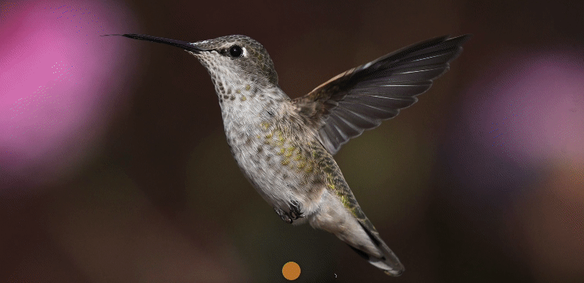
npm run devThe next step is to download a few images and add it to src/lib/images directory. We are going to use one as a background and the others for the navigation menu. In our case I will be using five.
– annas-hummingbird.jpg
– bread.jpg
– forest.jpg
– puffin.jpg
– spider-web.jpg
– vietnam.jpg
The rest of the changes is going to happen in src/routes/+page.svelte file.
Main content
The first step involves adding a background div. To let the main content to always appear as the background layer we are going to set the z-index of 1 along with centering the background image and setting it to the full window size.
What you will notice is a white border around the image. This is caused by the margin in the body tag. Since we are in a Svelte component and the body tag is in the app.html we cannot change the css unless the global modifier is added.
<script></script>

<div class="background"></div>

<style>
  /* content */
  .background {
    background-image: url($lib/images/annas-hummingbird.jpg);
    background-position: center;
    background-size: cover;
    height: 100vh;
    width: 100vw;
    z-index: 1;
  }
  :global(body) {
    margin: 0;
  }
</style>
Menu button
The next task is to place the menu button in the bottom center of the window.
We are going to add a button inside a flexbox which allows us to align it horizontally with the justify-content property. Then a click listener is added to the button which toggles navActive allowing us to see whether the navigation menu is shown or not. On the basis of that we are going to use the style element directive of Svelte to dynamically set the background color based on the state of the menu button.
Utilizing the :hover and :active pseudo class to provide user feedback when the mouse pointer is hovering or clicking the menu button.
<script>
  let navActive = false;
  const toggleNav = () => {
    navActive = !navActive;
  };
</script>

<div class="background"></div>
<div class="menu-container">
  <button
    class="menu"
    on:click={toggleNav}
    style:background-color={navActive ? '#3c4cc7' : '#c38133'}
  ></button>
</div>

<style>
  ...

  /* menu button */
  .menu-container {
    display: flex;
    justify-content: center;
    position: fixed;
    height: 100px;
    width: 100vw;
    bottom: 0;
    z-index: 3;
  }

  .menu {
    height: 80px;
    width: 80px;
    border-radius: 50%;
    box-shadow: 0 0 20px rgba(0 0 0 / 40%);
    border-color: transparent;
    transition: background-color 0.5s;
  }

  .menu:hover {
    transform: scale(1.05);
  }

  .menu:active {
    transform: scale(0.95);
  }
</style>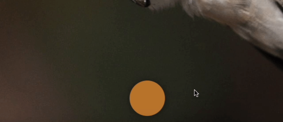
Navigation content
The next step is to add the curtain-like navigation bar that going to transition from the bottom to the middle of the screen when clicking the menu button. This contains:
– Create a new div with css class .nav
– Add transform style directive with translateY to the .background and .nav div for the curtain effect
– Set position, size and background-color for .nav div
– Add transition property to .background and .nav with a cubic-bezier curve to make it look better
<script>
  let navActive = false;
  const toggleNav = () => {
    navActive = !navActive;
  };
</script>

<div class="background" style:transform={navActive ? 'translateY(-50%)' : ''}></div>
<div class="menu-container">
  <button
    class="menu"
    on:click={toggleNav}
    style:background-color={navActive ? '#3c4cc7' : '#c38133'}
  ></button>
</div>
<div class="nav" style:transform={navActive ? 'translateY(0%)' : 'translateY(100%)'}></div>

<style>
  /* content */
  .background {
    ...
    transition: transform 0.65s cubic-bezier(0.45, 0.02, 0.09, 0.98);
  }

  ...

  /* nav bar */
  .nav {
    position: fixed;
    bottom: 0;
    left: 0;
    height: 50%;
    width: 100vw;
    overflow: hidden;
    background-color: black;
    transition: transform 0.65s cubic-bezier(0.45, 0.02, 0.09, 0.98);
    z-index: 2;
  }
</style>
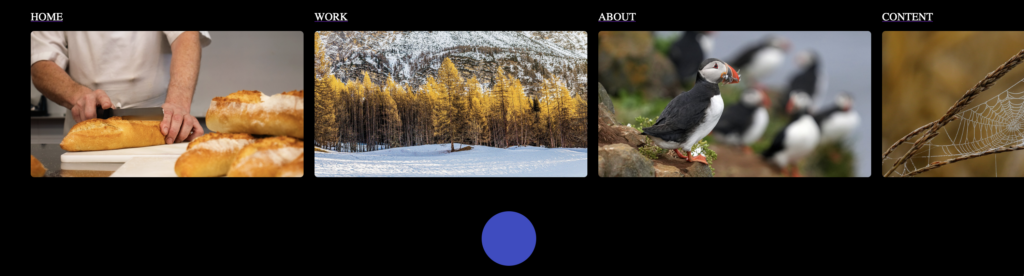
To finish it off, we are going to add the navigation menu items.
– Import the other images in the script part so we can reference them in our HTML.
– Add a ul containing the navigation text and image wrapped in a link
– Adding style directive to the ul to enhance the curtain effect.
– Use some basic styling for the image (round corner, scale bigger while hovering) and navigation text
<script>
  import bread from '$lib/images/bread.jpg';
  import forest from '$lib/images/forest.jpg';
  import puffin from '$lib/images/puffin.jpg';
  import spiderWeb from '$lib/images/spider-web.jpg';
  import vietnam from '$lib/images/vietnam.jpg';

  let navActive = false;
  const toggleNav = () => {
    navActive = !navActive;
  };
</script>

<div class="background" style:transform={navActive ? 'translateY(-50%)' : ''}></div>
<div class="menu-container">
  <button
    class="menu"
    on:click={toggleNav}
    style:background-color={navActive ? '#3c4cc7' : '#c38133'}
  ></button>
</div>
<div class="nav" style:transform={navActive ? 'translateY(0%)' : 'translateY(100%)'}>
  <ul
    class="nav-link-list"
    style:transform={navActive ? 'translateY(0%) scale(1)' : 'translateY(20%) scale(0.95)'}
  >
    <li class="nav-link">
      <a href="/">
        <span class="nav-text">Home</span>
        <img class="nav-image" src={bread} alt="bread" />
      </a>
    </li>
    <li class="nav-link">
      <a href="/">
        <span class="nav-text">work</span>
        <img class="nav-image" src={forest} alt="forest" />
      </a>
    </li>
    <li class="nav-link">
      <a href="/">
        <span class="nav-text">about</span>
        <img class="nav-image" src={puffin} alt="puffin" />
      </a>
    </li>
    <li class="nav-link">
      <a href="/">
        <span class="nav-text">content</span>
        <img class="nav-image" src={spiderWeb} alt="spider web" />
      </a>
    </li>
    <li class="nav-link">
      <a href="/">
        <span class="nav-text">join us</span>
        <img class="nav-image" src={vietnam} alt="vietnam" />
      </a>
    </li>
  </ul>
</div>

<style>
  /* content */
  .background {
    background-image: url($lib/images/annas-hummingbird.jpg);
    background-position: center;
    background-size: cover;
    height: 100vh;
    width: 100vw;
    z-index: 1;
    transition: transform 0.65s cubic-bezier(0.45, 0.02, 0.09, 0.98);
  }
  :global(body) {
    margin: 0;
  }

  /* menu button */
  .menu-container {
    display: flex;
    justify-content: center;
    position: fixed;
    height: 100px;
    width: 100vw;
    bottom: 0;
    z-index: 3;
  }

  .menu {
    height: 80px;
    width: 80px;
    border-radius: 50%;
    box-shadow: 0 0 20px rgba(0 0 0 / 40%);
    border-color: transparent;
    transition: background-color 0.5s;
  }

  .menu:hover {
    transform: scale(1.05);
  }

  .menu:active {
    transform: scale(0.95);
  }

  /* nav bar */
  .nav {
    position: fixed;
    bottom: 0;
    left: 0;
    height: 50%;
    width: 100vw;
    overflow: hidden;
    background-color: black;
    transition: transform 0.65s cubic-bezier(0.45, 0.02, 0.09, 0.98);
    z-index: 2;
  }

  .nav-link-list {
    display: flex;
    flex-direction: row;
    gap: 1rem;
    margin: 20px 0 0 15px;
    transition: transform 0.65s cubic-bezier(0.45, 0.02, 0.09, 0.98);
  }

  .nav-link {
    transition: transform 0.65s cubic-bezier(0.45, 0.02, 0.09, 0.98);
  }

  .nav-link:hover {
    transform: scale(1.02);
  }

  .nav-image {
    width: max(20vw, 400px);
    aspect-ratio: 71/38;
    object-fit: cover;
    border-radius: 5px;
    margin-top: 10px;
  }

  .nav-text {
    text-transform: uppercase;
    color: white;
  }
</style>